


I have a tendency to do my food shopping on the fly, tucking it into the empty spots in my schedule, often when something on my list has become a critical need. I am going in for items that I buy regularly, know where they are, know what they look like, and have calculated how long it will take me to conquer my list. I enjoy the activity of hunting down and gathering the items on my list, much like a scavenger hunt. My challenge is when I find myself in front of a display shelf, looking for “my product”. It can almost feel like a personal offense when I cannot find something that I have purchased regularly.
One of my regularly shopped items is yogurt and in the last year I’ve expanded my yogurt choices to include Greek yogurt, with its thick, creamy texture and the higher protein. I have tried several brands and even the store brand in a few selective situations. When I determined to try Greek yogurt and set out for the dairy section, my challenge was deciding on a brand. The only thing I had to draw upon was a brand name that was familiar, the only brand I had heard of – Chobani. This new purchase was not hard to handle, as the packaging was bold and plentiful.
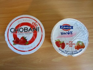
click to enlargeWith my increased appetite for Greek yogurt, a recent article in Advertising Age caught my eye– How Fage Lost the Greek-Yogurt War, First in Mind Trumps First in Category Every Time. It noted that Chobani, though it was not the first in the US market, became first in mind. Fage had been the first brand of Greek yogurt in the US market, but most people did not give Greek yogurt consideration until Chobani came on the scene. The different marketing approaches would be something to study, but being very visual, I got caught up in the packaging and the whole shopping experience.
Packaging can create a kind of bonding or ownership between a product and its consumer. When looking to purchase a new product, I am automatically drawn to the packaging with bold branding, with a clear name and qualifiers. If I have to look too long to figure out what that brand is about, I will move on to another. When searching for a regularly purchased product, it is the familiar package design that pulls me in. No longer will I look for a brand name, but the package design. Packaging in the greek yogurt section makes my point. If looking for a product name to jump out – it is Chobani – occupying much of the display, with a bold brand name and flavor profiles that brighten up the case. For return shoppers, the Chobani brand is a quick pickup with clear identity.
Two frustrating packaging changes you may remember were the Tropicana redesign and the white polar bear Coke can introduced for winter. With both brands, the manufacturer took something familiar and made it confusing and frustrating for the consumer at the point of purchase. Tropicana removed the familiar visual of the straw in the orange and changed the logo. Coke had a great idea of creating a seasonal can design as part of a charitable effort to help conserve polar bear habitats but did not figure on the familiar triggers brought on by a white Coke can. The new winter design was too close in color design to their Diet Coke, leaving shoppers possibly purchasing the wrong item.
Packaging is identity. Packaging is personal. While changes in packaging or introducing a new product package can be exciting, seriously consider the position of the consumer – when standing in front of the display shelf.