
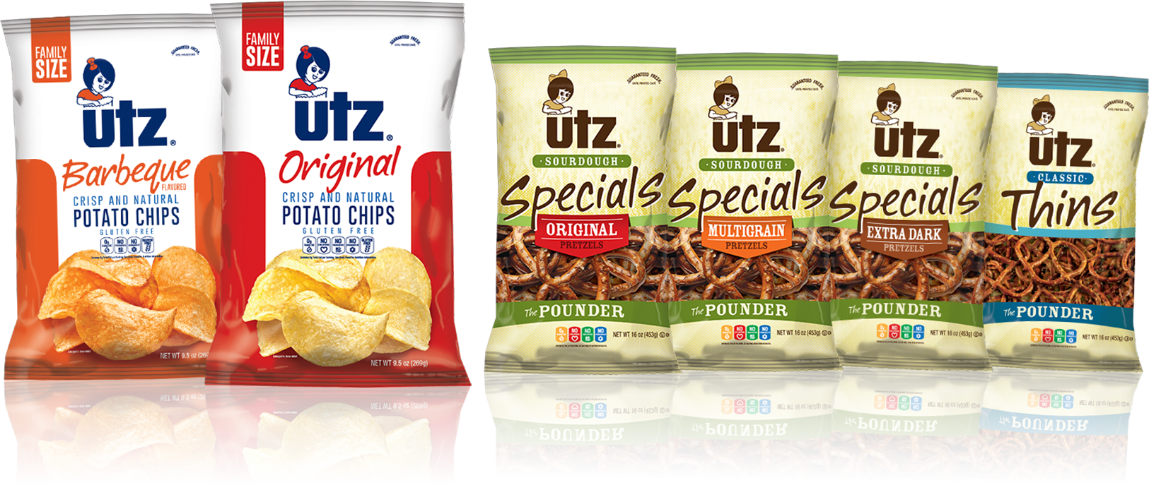
Utz Snacks
Utz was perceived as an older snack brand. Our goal was to evolve the brand without losing its iconic status and imagery that consumers were accustomed to looking for in the snack aisle. They also lacked continuity and clear messaging hierarchy between the various types of snacks.
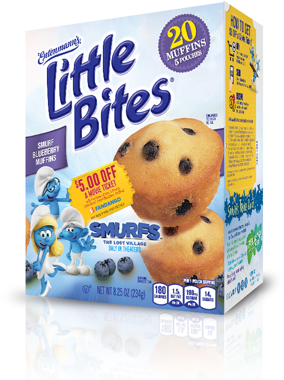
Entenmann's
Entenmann’s Little Bites was a major sponsor of Sony® Smurfs: The Lost Village. Our objective was to leverage the Smurf brand and maximize brand exposure.
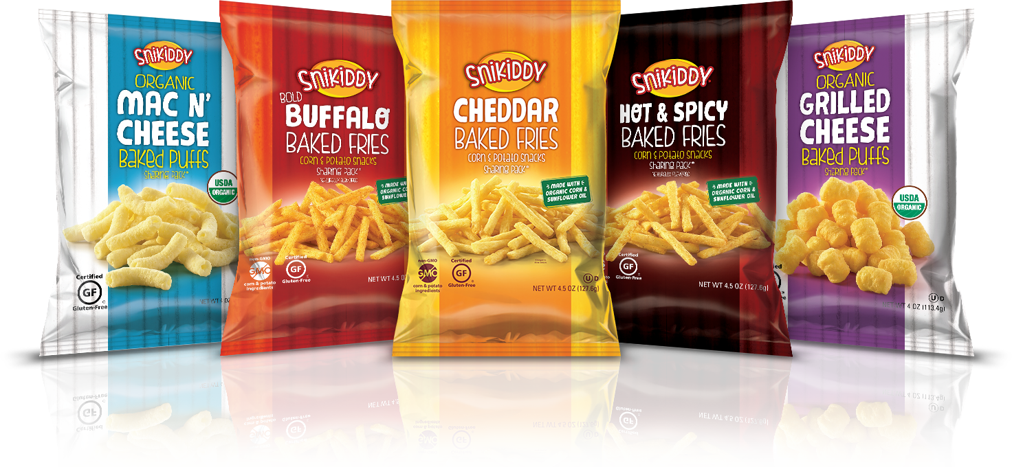
Snikiddy Snacks
Packaging was designed with a strong, vibrant color palette that jumped off-shelf, and vivid product imagery, along with appetite appealing photography. Creative and messaging were tested and optimized through Nielsen research.
Clear brand hierarchy for moms was developed to provide good-choice snacking for kids, tweens, teens.
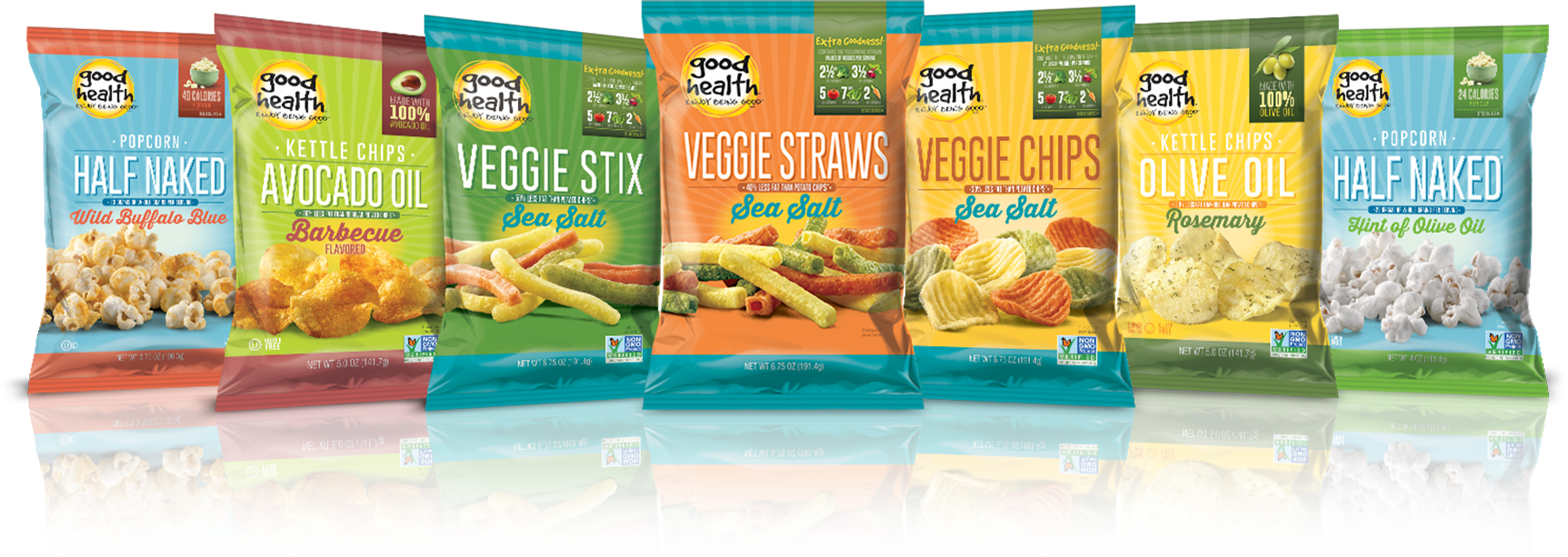
Good Health
Our goal was to develop new packaging that had mainstream appeal, while maintaining a look and feel that still resonated with core natural consumers. A design that would stand out and differentiate Good Health in the snack aisle, creating a strong brand-block, and quickly communicate the natural benefits of the snacks.
Designs were consumer tested and optimized through Affinnova research.
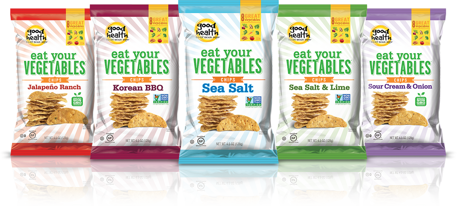
Good Health - Eat Your Vegetables
Eat Your Vegetables was developed as a line extension of Good Health. A clean white palette was utilized to showcase the all plant-based, clean label snack line.
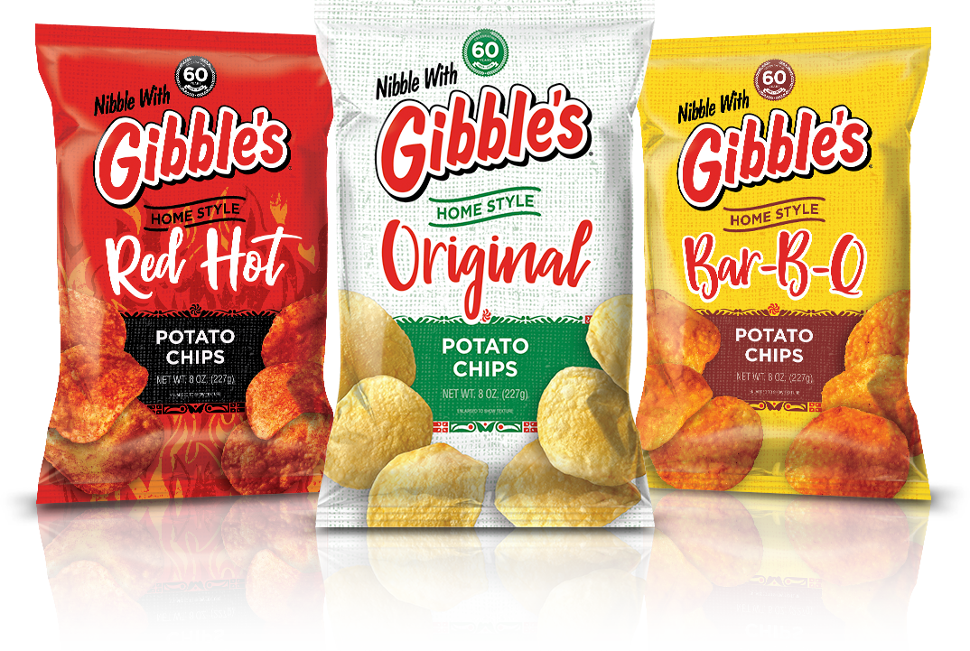
Gibble's
As a legacy PA Dutch, family-owned snack brand, Gibble’s packaging was old and in need of an upgrade. We were charged with modernizing the package design without alienating the loyal consumer base.
The recognizable Gibble’s logo was kept in the forefront; a burlap bag was utilized for the background, with modern color and font selection. New photography was also brought into the design to create that on-shelf appetite appeal.
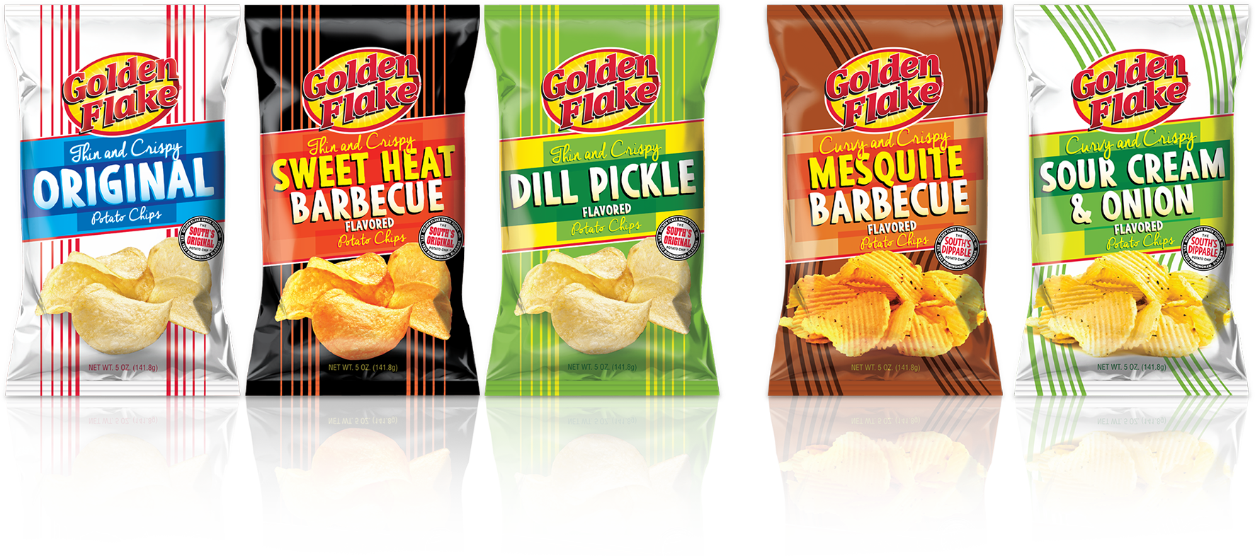
Golden Flake
Golden Flake is the southern choice for salty snacks. But their packaging was lacking when it came to brand consistency and shelf appeal. We created a design with vibrant color, distinctive imagery and consistent photography, creating a strong, memorable brand-block—all while holding true to their southern charm.
